A brand built from its name
Other Shapes is a studio that builds automation for businesses. I wanted the brand to look nothing like a typical tech consultancy, and to explain five services at a glance.
I started with the name. Shapes come in many forms, and none of them has to fit a mould. That idea of the misfit sits at the heart of the studio.
So I built the whole system from one simple shape: a half circle. Four of them make the logo. Moved, turned and resized, they make everything else. Colour follows the same idea: each piece gets one pair of colours, and pairs never mix.
I designed all of it, from the logo to the website, and built the site myself.
The mark
I wanted a logo simple enough to draw from memory. It is four half circles set around an empty square, and it follows one rule: each half circle is exactly as wide as the square. Nothing else is needed to draw it.
The website
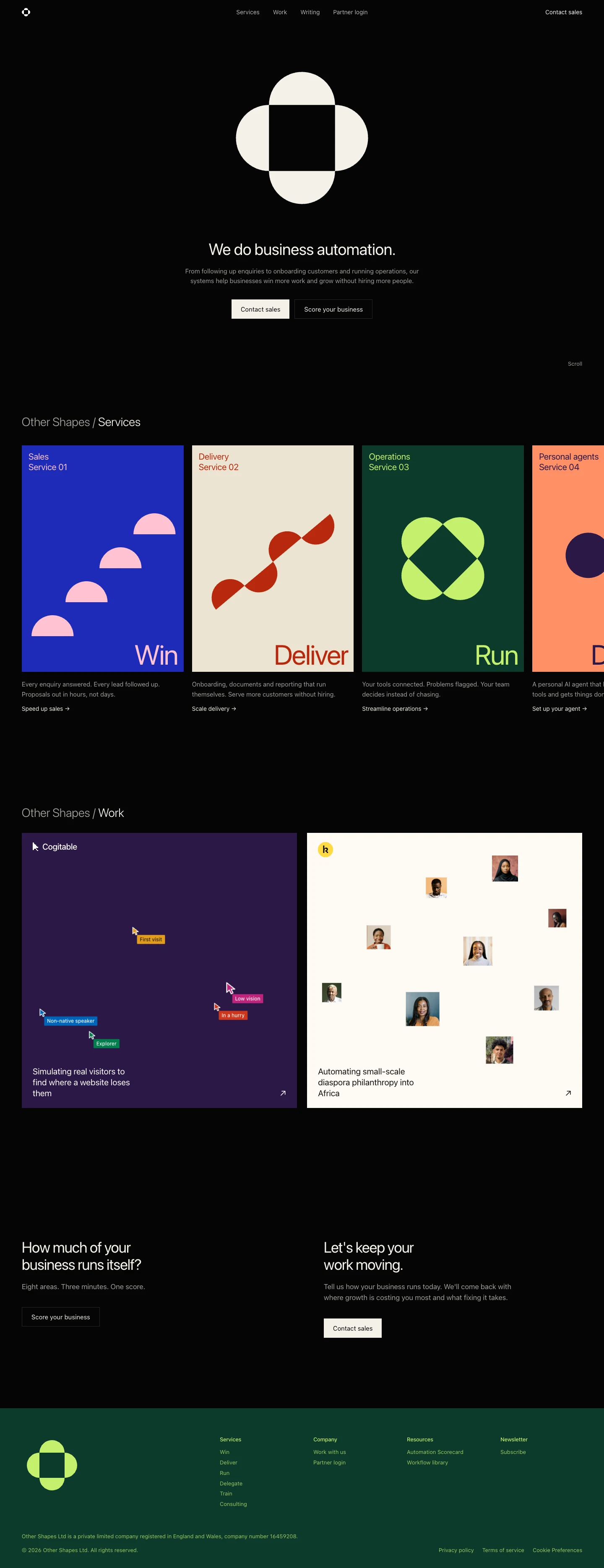
For the website, I kept everything quiet so the colour could speak. It is a black stage with one typeface in one weight. Bright colour only appears inside the posters, so when it shows up, it means something. At the top, the logo moves through its shapes, built from the same four pieces as everything else.
Colour in pairs
To stop colour turning into noise, I gave it one rule: it only ever comes as a pair, one ground colour and one ink colour. A poster never uses more than one pair, and the black stage sits underneath them all.
A poster for every service
I wanted each service to make sense before you read a word. So each one has its own poster, with the same four half circles arranged to tell its story. For sales, they climb like steps. For delivery, they make a wave. For training, skills stack one on top of another. For personal agents, two circles, you and your agent, join into one.
Because every poster comes from the same four parts, a new service gets its own poster without a new design project.